How we write UI at Twitter for Android

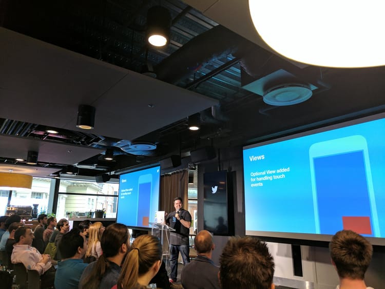
I gave a talk at 360|AnDev this year about how we modernized our UI architecture at Twitter, and a glimpse on how it looks like to write UI with it.
Preparing the talk was very fun, and I really enjoyed working on the contents. To be honest, I could speak for hours about this theme, and it's my day work (apart from my passion) too. I am currently a member of the Android Core UI team at Twitter, and I am the lead/main developer in our UI architecture framework that I talk about in the presentation, Weaver.
Presentation Materials
I tried to adapt my hand written diagrams and animations with the new presentation branding, and I am quite glad with the result. I didn't have much time to work on these though, but they ended up great.
The presentation in the event itself was 30 mins but I had to speedrun through that, because the presentation is a 35/40 min one. I recorded a dry run with a bit less hurry here, and it also contains the animations at 60fps so you might be able to enjoy it more. It also doesn't have my face in it so that might be a bonus (?).
And the slides content to consume on your own pace can be found here.


